Tuesday, 20 September 2011

Assignment Four - Applying Lighting Techniques

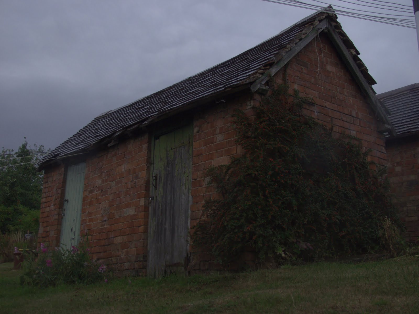
For this assignment, I chose one of our childrens shape toys, something which exhibited a range of different shapes, colours and textures, designed as it is to excite a childs' imagination and learning.

As a still life, I had a good level of control over the composition, lighting and placement of the camera. I could experiment with the various types of lighting modifiers which I had experimented with elsewhere in the chapter.

My tools were limited to a compact camera on a tripod, together with a pair of table lamps, black and white card and a translucent sheet of thin paper to act as a diffuser.

In this first shot, I wanted to emphasise colour, limiting the composition to include the three primary colours against an unlit background. The yellow ball is the point of focus which emphasises its position as the key element in the image, approximately on the '3rd'.

Lighting was directional, predominantly from the right side of the camera. Considering the reflectivity of the materials, I used a diffuser to soften any highlights which would otherwise have been apparent.


In this second image, I was exploring the effect of different types of lighting, in particular back lighting reflected off the (black) card placed at the back of the composition. The room wasn't entirely in black, so I've recorded some light scatter, avoiding a total sillouette. The key light was on the left side, with a less intense light positioned on the right.

The actual subject is only partly illumated, which has had the effect of diminishing the intensity of the colours, losing most if not all of the texture and giving the image a flat, two dimensional effect.


In this third image, I've tried to emphasise the inherently three dimensional effect of the subject. The key light was placed on the left side, but shadows which otherwise would have formed have been filled with a second light on the right side.

The lighting is predominently from in front of the subject, so the colour of the pieces is well illuminated but not dominant in the image.


This next image, my 'totem pole', has complexity on various levels. Firstly, the composition is assymetric and a little unusual with the emphasis to one side. Perhaps a contrasting element on the right side of the image would have imparted some balance to the composition.

The colours capture the primary and secondary colours. In relative size, they are broadly equal, perhaps with the yellow dominant but with the blue disk the strongest colour.

Lighting is harsh, with no reflectors. One light was used to illuminate the background, making it near completely white. A second light from the right side of the camera boosted the illumination of the back wall, but was primarily used to illuminate the subject whilst generating clear highlights.


So far, the images have not shown any evidence of texture, either because the object was brightly lit with semi-front lighting to obliterate any texture, or in the case of the third image, because the subject is too far away to show the fine detail. Even with a more sophisticated camera, although the detail may be captured, the human eye is not capable of seeing any level of texture.

So the implies that texture involves getting really close to the subject. This is partly correct, but the distance depends on the coarseness of the texture, so for instance the 'texture' of a ploughed field is visible from several feet away, whereas the texture of a piece of glass is only visible under an electron microscope.

In this case, the level of texture required a subject-camera distance of 2-3 inches, the limit that the camera was capable of. The light was more subdued and intended to be running along the surface of the wood so as to emphasise the surface roughness. This was only partly sucessful, mainly because I wasn't able to collimate the light sufficiently to make it truly directional.

Compositionally, the image is clearly very simple. Being a macro shot, it was relatively easy to create something which is a little abstract and virtually unrecognisable from the previous images (of the same subject).


The assignment taught me a good deal about controlling and manipulating light for visual effect, using simple materials which were readily available, to create a range of quite different images of a single object.

This will be a good lesson in how to use light to dramatically change the character and style of a single image, useful when taking photographs which need to fit a particular brief (eg. dramatic images for a front page, or a more subtle image for a quieter application).

Sunday, 4 September 2011

Timelapse covering night until dawn. Colour and brightness go together. Issue is how to control the camera - in auto exposure, the camera will try to maintain the same exposure regardless of the environmental conditions. With manual exposure, the camera will retain the same settings, but this is a compromise between getting some detail in low light conditions and being very overexposed as ambient light levels increase. What's interesting is how quickly daylight (and nightfall) comes - all the action takes place in 5-10 minutes.


Thursday, 23 June 2011

Lighting angle

Here I took a still life beer glass, illuminated from different angles using a simple table lamp.

Similar to the post, 'Variety with a low sun', the shots into the light are much more dramatic and interesting than those with the light behind the camera, and here with the translucent glass, the rim lighting effect is increased. The front lit images are fundamentally flat, and nothing can be done in Photoshop or similar to correct this.


Softening the light

Here I took some fruit, shooting with and without a simple piece of paper between the light source (table light) and the subject to act as a diffuser. I lost about 2 stops of light, but auto exposure compensated for this.The closer I got the paper to the subject, the less distinct the highlights in the fruit.

In this case, the diffused image looks 'flat' but there is a quality of light which could be very suitable to some subjects. For instance, I did another shoot of aluminium drink cans which are very reflective, for which the diffused light is useful to prevent burnout of the highlights.

I think its a case of adjusting the light to suit the subject.


paper diffuser over (top) light

no diffuser

aluminium can, paper diffuser over light, foil reflector to right

Variety with a low sun

Here I was tasked with shooting an object with a low sun, moving around it to show the effects of frontal lighting (sun behind camera), side lighting, back lighting (shooting into sun) and edge lighting.

For this, I choose a simple footpath marker post as something of bright colour which I could move around freely:-


What I see is that as I shoot progressively towards the light, the image becomes more interesting, ultimately creating a dramatic sillouette, even of this uninspiring object. With less exposure, I might have achieved a rim lighting effect, but even without, I've got a dramatic black/white effect with maximum contrast.

By contrast, the frontal image is flat. Any texture in the wood has disappeared, unlike in the second shot where the light is from the side.

All shots were taken with 'auto exposure' and no attempt to bracket. So even with a very basic camera or phone, its apparent that varying levels of interest can be achieved in an image simply by modifying viewpoint relative to the light source.

Measuring Exposure

Here the images were shot, ranging from 2 stops underexposed to 2 stops over. With the flowers, the overexposed images appear more pleasing as it emphasises their colou, even though parts of the images are burned out. The 'correct' exposure looks dull. Even though the background is brighter, its out of focus and hence still does not distract the viewer.

So here's an example where the camera's 'correct' exposure is not necessarily the ideal.


Sunday, 19 June 2011

Another long delay

Back on the course after another long delay. I've been spending the past few months preparing for the art show in the village where I've been exhibiting my work 'old and new', a collection of old photographs of the village combined with my new shots taken from the same viewpoint.
The show went OK, and I sold a number of pieces of work, but mainly the old photo's - people didn't generally see the interest in the new shots. I never did see the new shots as being particularly photogenic - the village 100 years ago was very much a working village and neatly kept, whereas now its a largely a commuter village and the style seems to have become one of 'leave nature alone', which results in the place getting somewhat overgrown! I guess the new photo's will be appreciated in the years to come. For now I'll probably donate them to the county records office.
All of this has mean't that I haven't had much time for the course. Hopefully that's about to change. Partly with the challenge of a new assignment and partly as I reach the end of the course and have the opportunity to bring together what I've learned in work that is hopefully more artistic.

Images to follow tomorrow.

Thursday, 17 February 2011

Comments on colour

I'm finally getting ready to submit my OCA assignment three on colour after a long period of apparent inactivity. Colourblindness isn't something that's immediately obvious, indeed I didn't know I'd got it for many years and it hadn't really caused any problems that I was aware of.

Now this assignment has forced me to confront this issue and try to incorporate colour into my photography.

Back in the autumn, I had the opportunity to visit the Steve McCurry retrospective in Birmingham. I'd seen the 'Afghan girl' like everyone else, and a few other lesser known images of his, but this was a rare opportunity in the Midlands to see the work of a top photographer.

I knew his work was 'colourful', but its only now when I look at his blog (http://stevemccurry.wordpress.com/), that I've suddenly become aware of how he used colour as a compositional tool as well as to give balance and contrast in his images. On the face of it, living in a rural area where colours tend to be quite muted is a problem, but I think this is an advantage compared to a city where colourful objects are more plentiful and its perhaps less easy to make colours stand out.

This is definitely going to take effort on my part, but I think I may have just learned a new technique which I'll try to incorporate into my work.

Sunday, 13 February 2011

Old new photographs

At the end of 2010, we had a presentation in the village of old local photographs. The suggestion was made that I might have a go a re-shooting some of these.

Here's a few shots to show the concept.....


It hasn't changed much, at least in these pictures.

The idea is to present these and others at the village art exhibition in the spring. Photographically, the focus is more on an historical record than somethat artistic, however there is still scope to apply my vision to the shots.

For instance, I'm asking myself how to present the differences. Do I attempt to replicate the idealised pastoral scenes in the style of Roger Fenton (ref. 'Mill at Hurst Green' from 'The Photograph' by Graham Clarke)?

That would be quite difficult, in particular because cars litter the place, at least at weekends when I'm able to go and shoot. Not only that, there's a lot more vegetation around, obscuring some views completely and giving the place a less well ordered impression. Gardens are generally well kept, but not in the tightly ordered style visible in the original shots.

To what extent do I attempt to hide these changes, for instance by asking people to move their cars out of shot and choosing 'nice' weather to get 'pretty' pictures? Or should I attempt to  highlight the changes? Perhaps its inevitable that those differences will be apparent, it just depends how closely the viewer observes the shots. What do you think?