A long period since my last blog, not altogether quiet on the photography front, but not as much as I'd have liked to have done.
The majority of the shots here were taken digitally in the back garden. I've generally managed to find inspiration wherever I'd shot and I believe the discipline of shooting with fixed geographic boundaries forces me to spend more time concentrating on the shots and less time believing that the grass is always greener around the next corner.
Firstly, triangles, real and implied:-

A triangle formed in the shadow of the stones

Another picture of triangles, all leading to the circle at the 1/3rd.

Another picture of triangles
Next, squares and rectangles:-

A collection of squares formed by the (rotten) bottom of the garage doors.

Rectangle formed by the sunlight portion of the trees, bound by the telegraph pole, cable and horizontal shadow.

Two rectangles, light and shadow.
Next, circles and curves:-

Cut tree branch stump

Multiple circles, could have been a study on colour or perhaps implied triangles.
Beyond this, I tried to combine a number of shapes in a single image. Not sure if this is entirely successful though - fun to do but perhaps it dilutes the impact of the shot:-

Dominant rectangle of the entrance. I like the jaunty angle of the garden chair with its legs crossed - somehow almost looks human. In the shadows, there's the circle formed by the lawnmower

Lots of triangles in the silouette of the greenhouse, or is it a diamond?

Rectangles in the wall, and triangles in the pipework.

Dominant circle of course, but then there's the rectangle of the old sandpit leaning against the wall, the dark entrance again and the circles formed by both the water butt and the old tyre. The three circles form a diagonal bottom left to top right, which perhaps balances against the square top left.

Saw something in this image, though clearly its not strong. There's the implied triangle of the water trough, vertical line formed by the edge of the hedge on the right perhaps balanced by the canes top left, and the brick parts form an inverted triangle.
The exercise has been useful on a number of counts. First, it got me really looking for strong shapes in images to give them impact. It significantly broadened the subject matter I would normally take. Shooting early evening with the rapidly changing, I learned a lot about exposure, shooting manually with spot metering which I think has helped me to shoot images which are stronger in composition and less dull than some of my previous work.


 The last one is interesting. I'm convinced this fleece is grey in real life, though I accept that on the screen its not, but quite what, I'll have to trust my wife!
 Converging lines
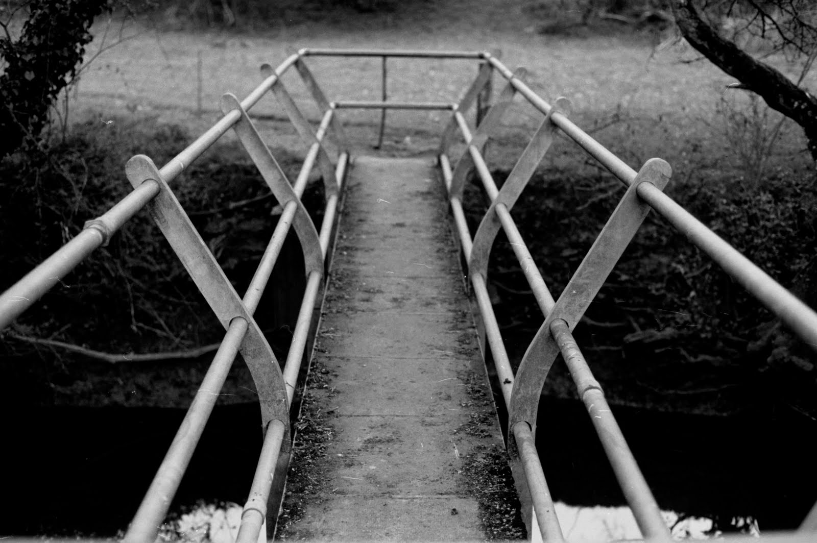 Converging lines #2
 Implied triangle
 Pattern
 Rectangles
 Pattern
 Pattern
 Triangles
 Not clear, perhaps vertical lines and triangles
 Implied lines
 Pattern of the clothes pegs on the line.
 Pattern in the clothes basket
 Patterns in the strawberry netting
 Pattern in the tiles, with the addition of the cracked tile and white stain symmetrically placed on either side of the image.
 Pattern in the back of the chair.
 A triangle formed in the shadow of the stones
 Another picture of triangles, all leading to the circle at the 1/3rd.
 Another picture of triangles
 A collection of squares formed by the (rotten) bottom of the garage doors.
 Rectangle formed by the sunlight portion of the trees, bound by the telegraph pole, cable and horizontal shadow.
 Cut tree branch stump
 Dominant rectangle of the entrance. I like the jaunty angle of the garden chair with its legs crossed - somehow almost looks human. In the shadows, there's the circle formed by the lawnmower
 Lots of triangles in the silouette of the greenhouse, or is it a diamond?
 Rectangles in the wall, and triangles in the pipework.
 Dominant circle of course, but then there's the rectangle of the old sandpit leaning against the wall, the dark entrance again and the circles formed by both the water butt and the old tyre. The three circles form a diagonal bottom left to top right, which perhaps balances against the square top left.
 Saw something in this image, though clearly its not strong. There's the implied triangle of the water trough, vertical line formed by the edge of the hedge on the right perhaps balanced by the canes top left, and the brick parts form an inverted triangle.
 The use of black and white, and the texture of the worksurface adds some tonal interest to what is a strong image, but one lacking in real meaning.


